 HeadTidy
Small dashboards, exactly where they help
Keep the picture beside the thinking. A Dashboard card can explain a table, track a number or support a decision without turning the whole map into software to configure.
Attach a chart to the table it explains
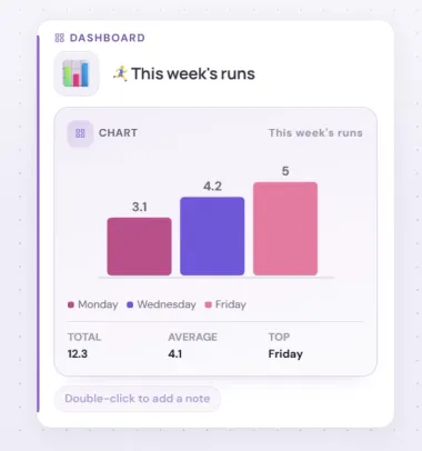
Add a Dashboard from any card’s plus menu, choose Chart, then select a Table on the same map. HeadTidy supports bar, line, area, pie, donut and scatter charts, with editable label and value columns, palettes, legends and value labels. Legends and a total, average and top-category summary are on by default. Change the table and the chart follows.
Use one-purpose widgets
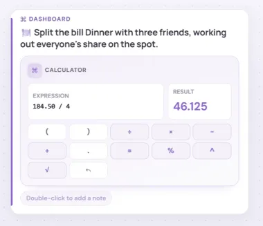
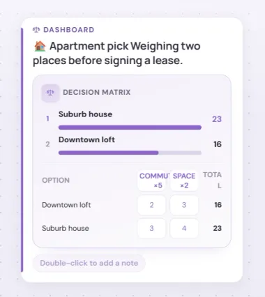
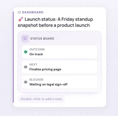
The same polished picker works on desktop and phone and gives every widget its own colour. Edit a calculator expression, countdown date and quick-form answers directly on the card; count and reset; move between calendar months; score weighted decision options; update an Outcome, Next and Blocker status board; rate an item; start, pause and reset a focus timer; track progress toward a number with a Goal bar; or tally quick votes with a Poll. Details remains available for deeper setup.
Keep every card readable
Widget headings and controls are sized to avoid strange wrapping, and larger matrices scroll inside their card instead of crushing labels.
Keep dashboards in context
A widget is an ordinary card in the map: it can sit beneath a project, travel with a branch, appear in a private shared view and survive JSON backup. It does not create a separate data silo.
Try before you sign up
The live example includes a chart attached to a team table. Open its Details to change chart type and presentation, or use a card’s plus menu to add another widget without an account.